React Placeholder loading state
It seems like loading transitions and states come and go over time, and people try to get as creative as they can with them. Making cool animations from parts of their logo’s, to using nice imagery to give the impression of loading, You only need to search around your favorite search engine to find some amazing examples of loading UI’s.
It may of been around longer that I think, but it seems the “placeholder” style loading UI is becoming a lot more popular this days, or maybe it’s just the site’s I visit most regular are starting to use them. Even that popular that I have been working on a “placeholder” loader for my day job. Just in case your wonder what I am calling a “placeholder” loader, it’s a loading UI that simulates the look of the content that will be loaded but using a wireframe like design. So a user will see some shapes that are light in color.

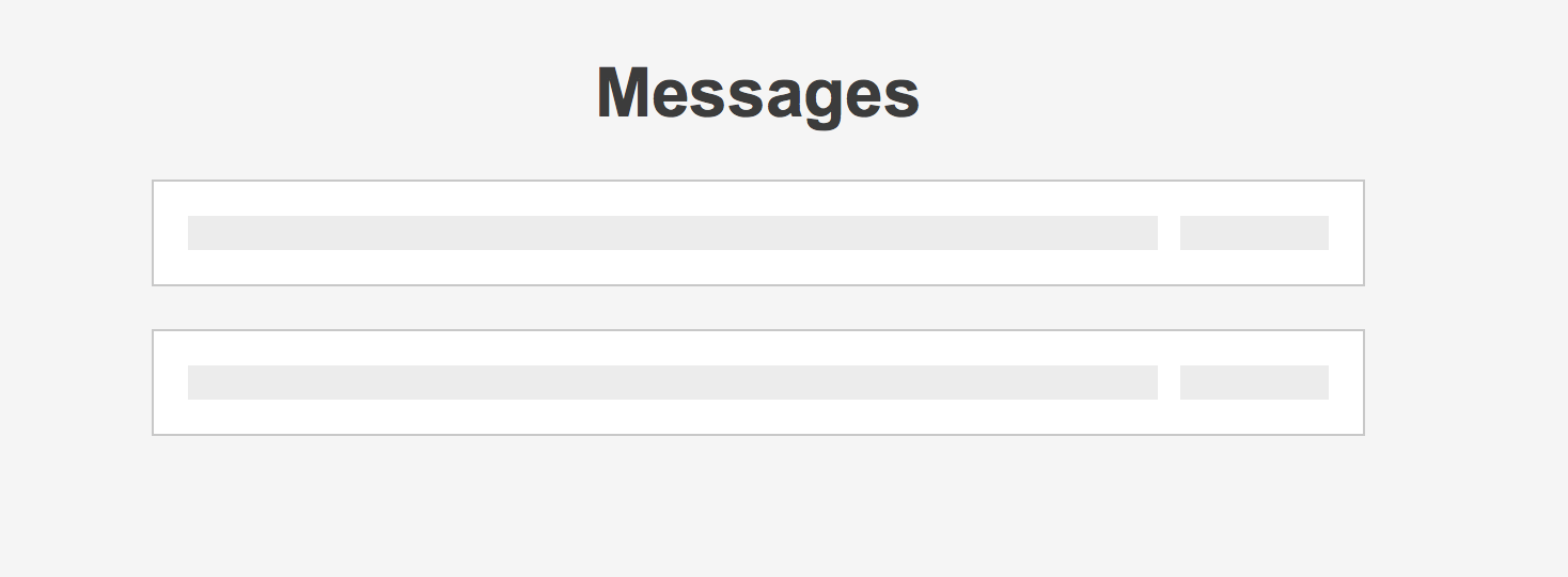
You may or may not of seen something very similar used on Facebook, the image is taken from a blog post that explain’s how it’s achieved. After reading the post, I was quite surprised on the amount of markup needed to achieve the desired affect. Having a requirement to produce a similar looking loading UI for a project I took some time to see if there was a nicer approach for the project I was needing to apply it to. The project I was going to be applying this too was a little simpler in terms of what was being displayed to the user, the UI I was going to be applying this to was a list of messages, consisting of an icon, couple items of text and another icon.
Rather than use div’s to mask the background and fill in the spot’s that I did not want to show the background animation, I used the elements of the messages from a loaded state to apply a loading state on to. Example of my demo can be seen here, with the code available on GitHub.
In the demo a message has a title and a created prop in it’s loaded state which should be text, which is what you see once the messages have been loading (in the case of the demo I use a setTimeout to simulate loading). To get the loading affect I set up the react component with some initial state for the messages, but with the values of the props empty, also telling the component we are in a loading state which applies a placeholder class to the messages div, then using CSS I make the p’s in the message component have a min-height of 1em to ensure the blocks are rendered out as blocks rather than no appearing as the contents are empty.
While it’s not a one stop solution for all placeholder loading within a web application to simulate the content’s UI, for simple items it’s a nice simple solution to apply.